ATG Entertainment
The Process
Arriving in the Beta phase, I defined my own roadmap including content drafts, facilitating workshops for leadership and cross-functional teams and handover.
Close Product team collaboration became the standard to understand context and user research findings before initiating changes and options.
All agreed changes were documented into a newly built Content Design System, which I maintained this throughout my contract and used when leading localisation operations for Germany, Spain and Austria.
Continue the evolution of content design as new insights were found and journeys and screens designed.
Information Architecture
Content thinking:
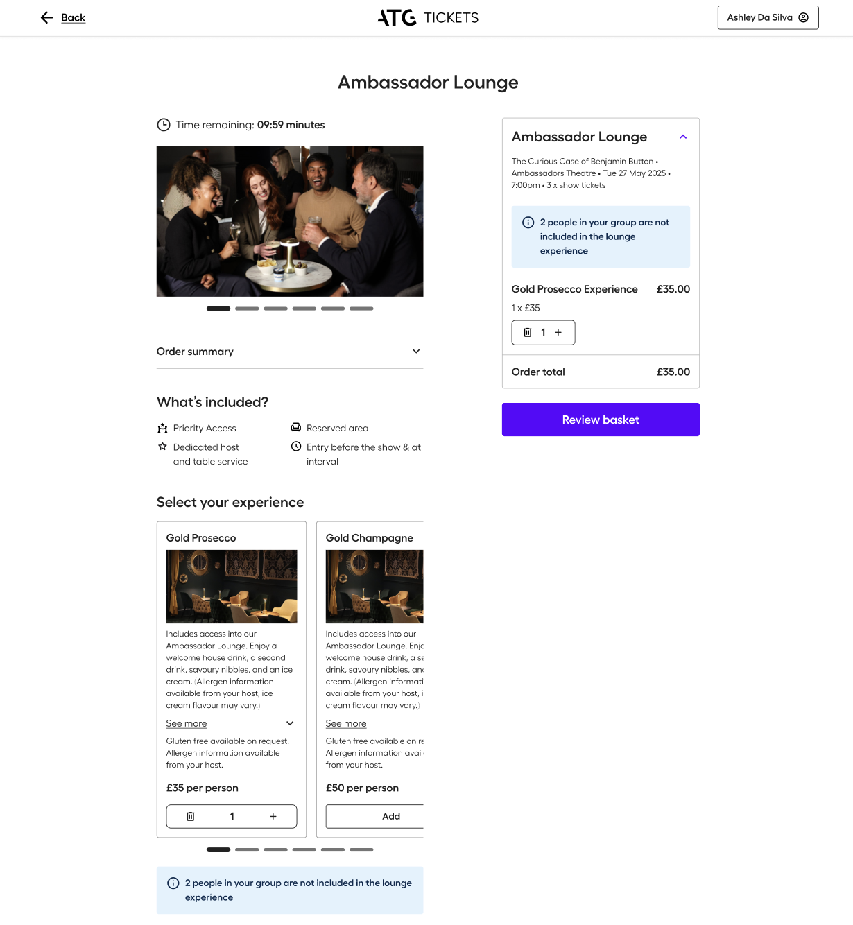
Order summary accordion moved to the top as an opportunity to cross check the show before selection.
Snapshot of product detail follows to reinforce their choice, via a simple question that empathises with user’s priority.
Product selection language header as an instruction.
Information box placed next to counter for instant detail and option to rectify.
Open basket follows the same format.
Result:
An organised product page that reduce cognitive load and therefore user hesitance and cart abandonment.
The Challenge
ATG Entertainment were launching their first app, ATG Tickets, while updating the web experience to align with it.
Having relied purely on their website and in-person box offices for sales and brand awareness, the company were up against multiple ticketing apps and aggregators that were leading the market.
Having identified 4-5 varied personas, the user experience and design needed to accommodate them all while maintaining brand tone across multiple departments.
The Solution
Demonstrate via live files and collaborations how a strong content strategy brings cohesiveness and efficiency to the product design process and results.
Implement a new Content Design System that ensures consistent, intuitive content across 5 squads and 5 countries to enter as a strong challenger.
Define content rules and patterns in a style guide removing doubt and stray designs.
Hold workshops with senior stakeholders to get more buy-in and understanding of the content strategy as the product progresses and grows.
Design content for all user journeys that meets both the ATG brand and product goals.
Examples of results
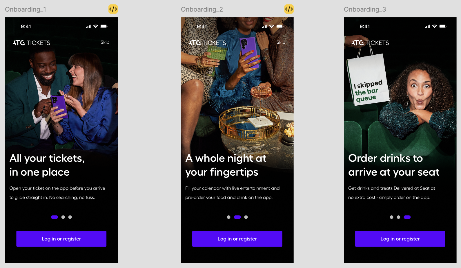
Onboarding
Content thinking:
CTA and ‘skip’ provide users quick options, if they downloaded the app to access tickets quickly.
Screens are ordered according to user priority and focused on app functionality.
Messaging hints at the differentiated E2E experience to expect.
Snappy, whole sentences are used, each 2 lines only for same eye movement and scannability.
Additional action- and benefit-led explainers for fuller detail.
Result:
Branded, informative onboarding with user-centered design and autonomy at its heart.
Content System Documentation & Localisation
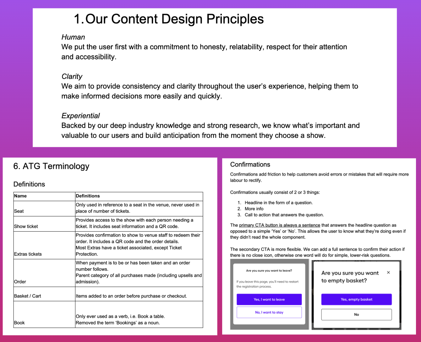
Content thinking:
Content Design for the whole business.
Lead with principles, add reasoning and explanation.
Provide in-action examples.
Simple, clear layout and formatting for quick referencing.
Result:
Became the reference for all new and existing designs across app and web, and localisation for Germany, Austria and Spain.