GumtreeGumtree was entering a new phase and its acquisition brought new product offerings and a refreshed GTM strategy.

Impact
Surfacing 80+ inconsistencies
Reduced copy rework by 50%
Lifted engagement by 10%
The Challenge
Gumtree’s UX was inconsistent and confusing. In its 25 years, the business added new verticals and features but without a single source of truth for teams on content style and strategy, trust had diminished and it was left behind as alternative marketplaces evolved.
My Approach
Build a solid content strategy that provides clarity and cohesive messaging across multiple departments.
Develop a content system and guide that demonstrates how to form strong UX copy alongside examples, and states ground rules for style, grammar and taxonomy.
Work closely with the designers to educate and give them more confidence and understanding of the content habits needed.
Meet with Design, Product, Marketing and Trust & Safety to understand their challenges and any business or vertical contradictions to cover as many bases as possible so the guide would serve as valuable asset in their ways of working.
Present competitor analysis, conduct a platform-wide audit and a proposal of what can be achieved according to my definition of what good looks like.
Set up weekly content calls with designers to understand context for new user flows and what’s next on the roadmap, with ongoing collaboration and discussion to achieve the most consistent and intuitive user experience.
Design content for new user journeys and align ad-hoc changes with the new content strategy and rules on existing UI.
The Work
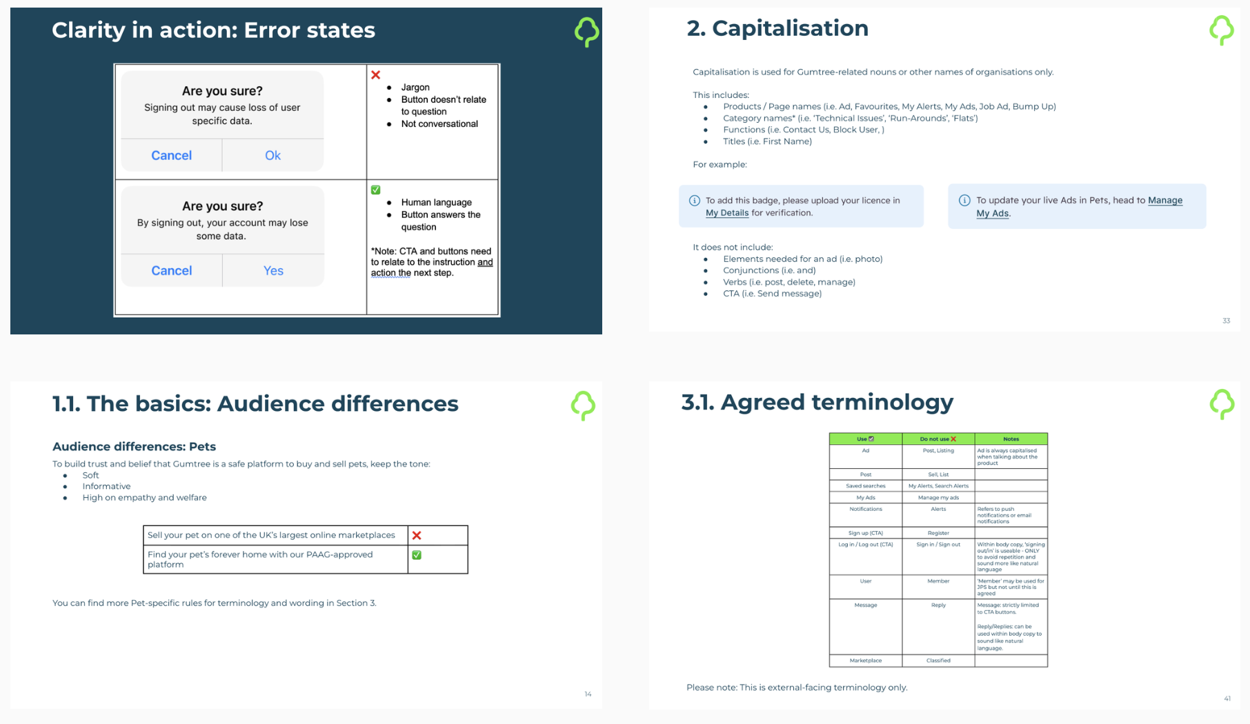
Content Design Style Guide
My keywords: Educational, practical, reasoning
What this means in practice:
A practical document for all departments including UX, marketing and sales enablement
A single source of truth for all things content and copy.
Clear, usable and teachable content.
Result:
A branded, comprehensive style guide including principles, basic grammar and mechanics, tonal shifts dependent on journey and vertical, a defined glossary and examples of good vs bad content design.
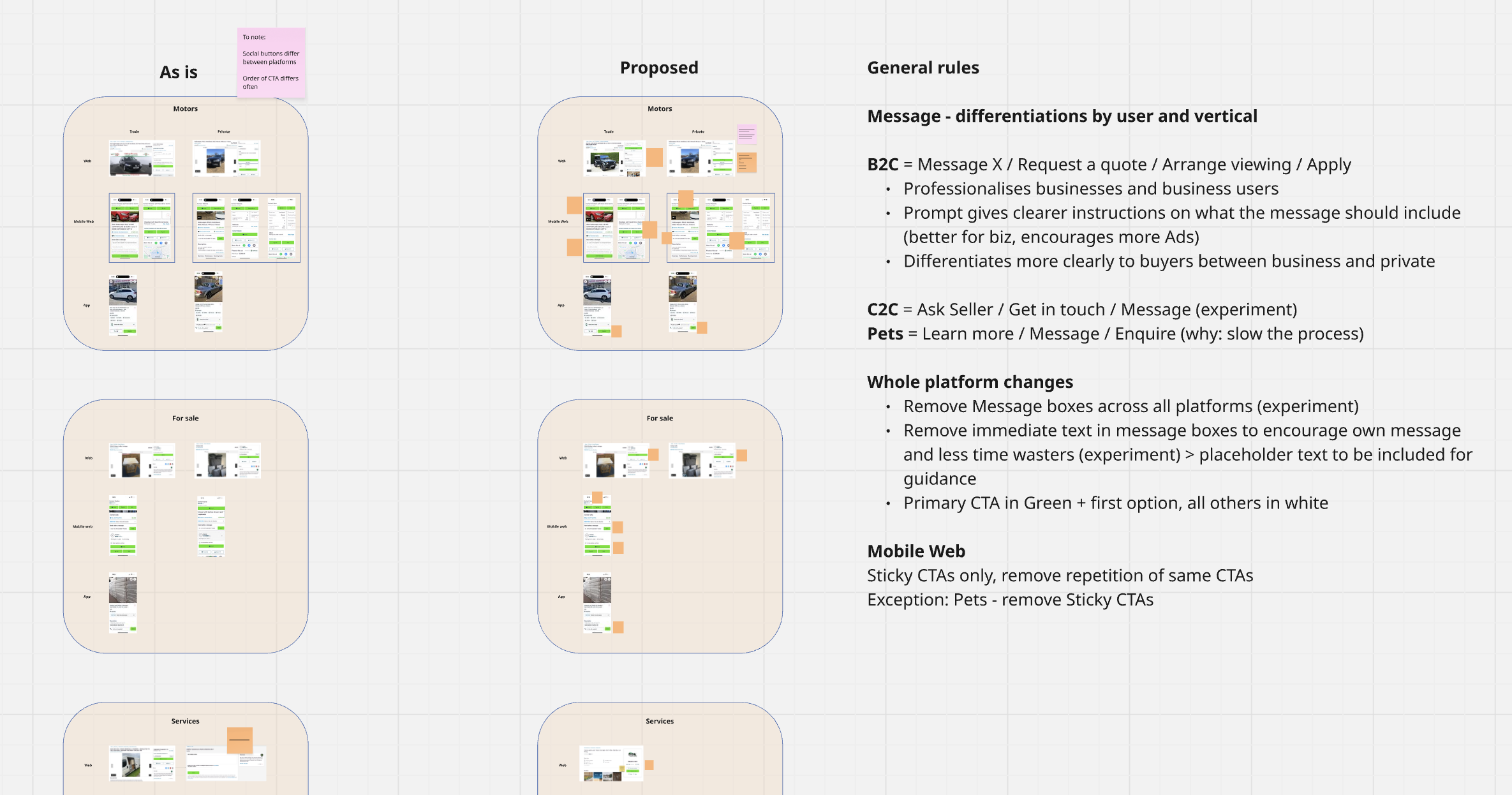
Defined Content Strategy
My keywords: User priority, trust, engagement
What this means in practice:
Investigation and insights into the preferred language and expectations of different verticals.
UI comparisons across vertical and between app and web.
Identifying opportunities to implement differentiated voice and encourage user engagement.
Proposing experiments for interaction and UX design changes.
Result:
Clear content strategy for the differentiated categories and verticals that allowed subtle tone changes while keeping the experience consistent.
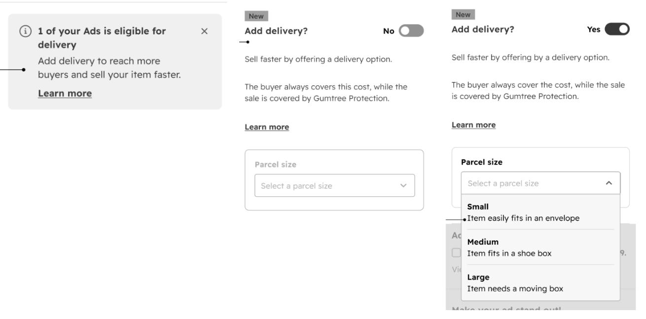
New User Flows
My keywords: Simple, accessible, no-brainer
What this means in practice:
Consistent terminology used throughout to avoid confusion.
User autonomy and options were prioritised in the design.
Information architecture remains the same: Information/option, benefit, more information to reassure.
Result:
Designed consistent and concise content for new user flows in Beta stage prioritising familiarity and small market differentiation for the brand.
Other case studies & work
ATG Entertainment
Cemantica

B2B Tech Writing
Teya