cemantica
The Process
Audit the platform and implement impactful content changes to priority user journeys. (Challenge: The audit needed to be broken down into segments because of the amount of user journeys, which found the multiple entry points overwhelming and the dashboard requiring a bigger design overhaul than planned.)
Other user journeys were optimised to include defined taxonomy, benefit-led statements and greater use of tooltips for icon-only buttons.
Build content design style guide alongside live work signed off by the Founder, including new tone of voice and brand work in collaboration with Sales, Product and Customer Success.
Examples of results
The Challenge
Cemantica had grown up and wanted the UX in their customer experience platform to reflect this.
Alongside this, the business had started plans to launch new products and features, and wanted a solid foundation from which to build on for future copy without a UX writer on hand.
The Solution
A whole platform audit for all user journeys to identify the gaps and inconsistencies.
Work with Head of Product, Sales & Marketing Director and the Founder to create and formalise the language and tone used on both platform
Author a definitive content design style guide.
Redesign key components alongside Design for greater clarity and helpful indicators.
Collaborate with Head of Customer Success to utilise and integrate real-world user feedback into existing content and new features.
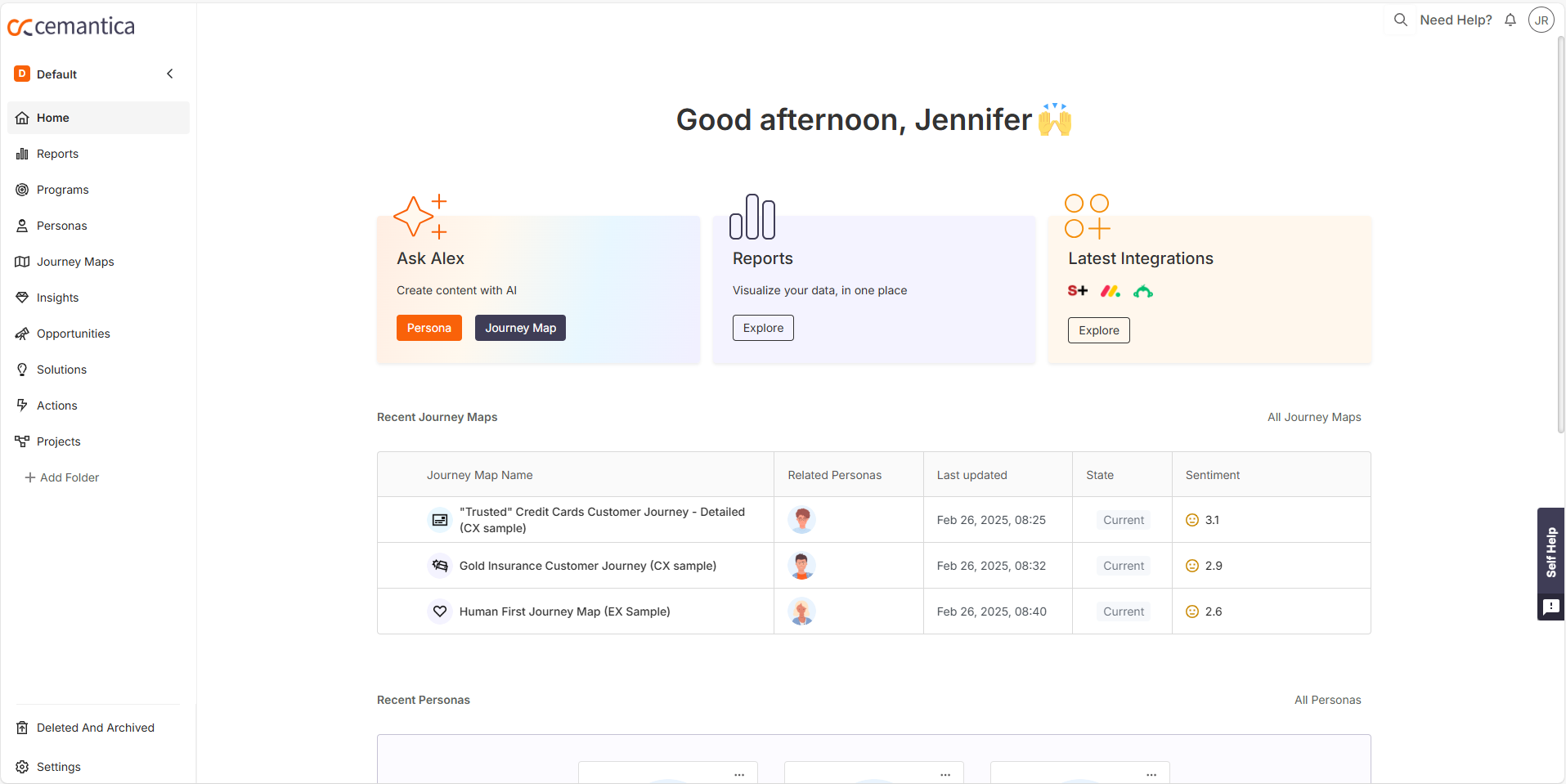
Clean, engaging dashboard
Content thinking:
Button labels and body copy have more clarity on the actions immediately available and their benefits.
Decisions made on taxonomy here allowed the language, tone and terminology on other user journeys to remain consistent.
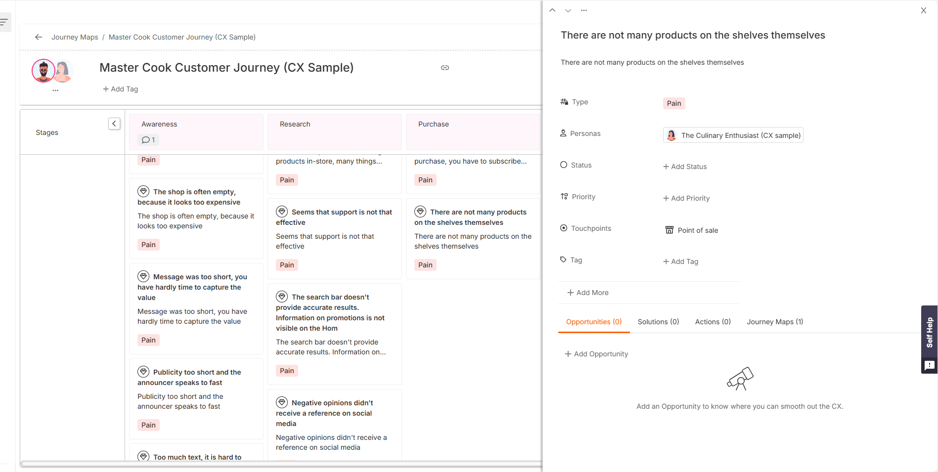
Key user journeys
Content thinking:
With so much of the data and content being created by the user, it was vital that all microcopy was concise, clear and didn’t distract but enabled them further.
Labels and icons were redesigned together to ensure accessibility and simplicity.
Empty states provided more context on the possibilities and opportunities available.
Result:
The end-to-end user flows were now clean and intuitive enhancing the UX.
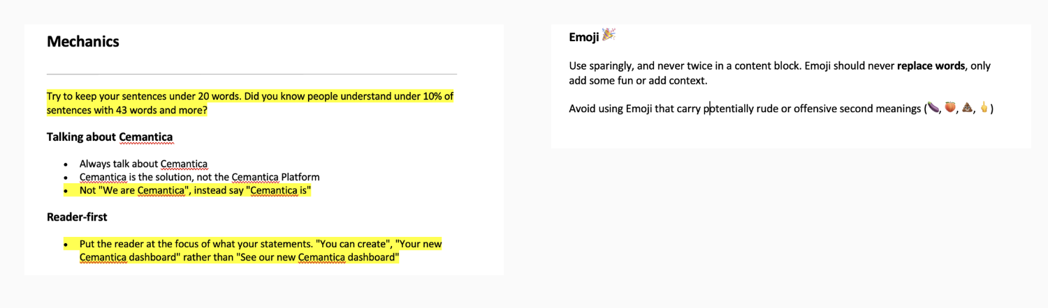
Definitive Style Guide
A content style guide was created that defined rules for the business. This meant every touch point - whether written or spoken - the same tone, terminology and taxonomy were being used.
Result:
This guide provided a solid UX writing foundation as more products, like an AI assistant, were being introduced. It would be consistently referred to by Sales & Marketing, Product and Customer Success.